Freelance
Title Treatment | QA | Graphic Design

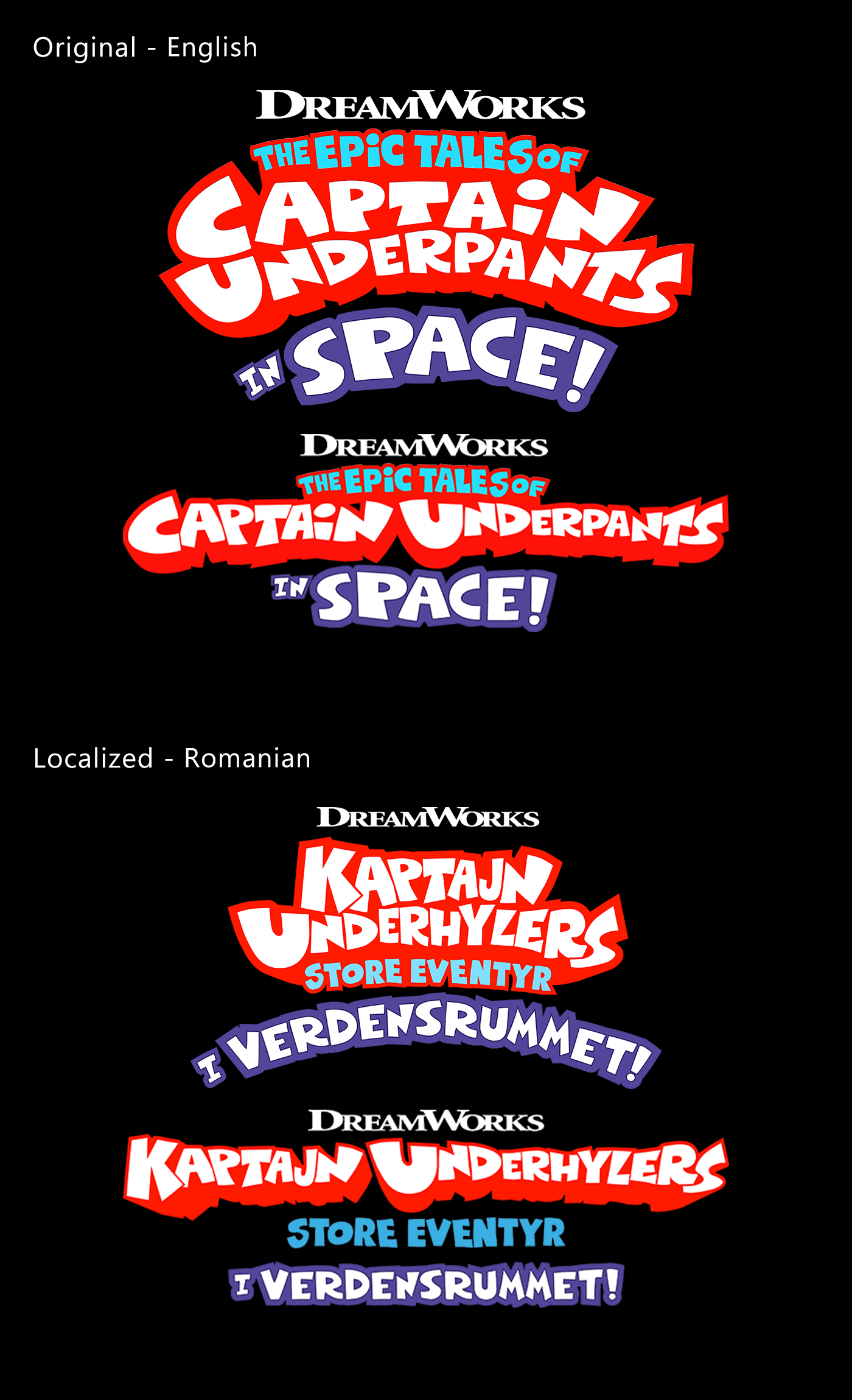
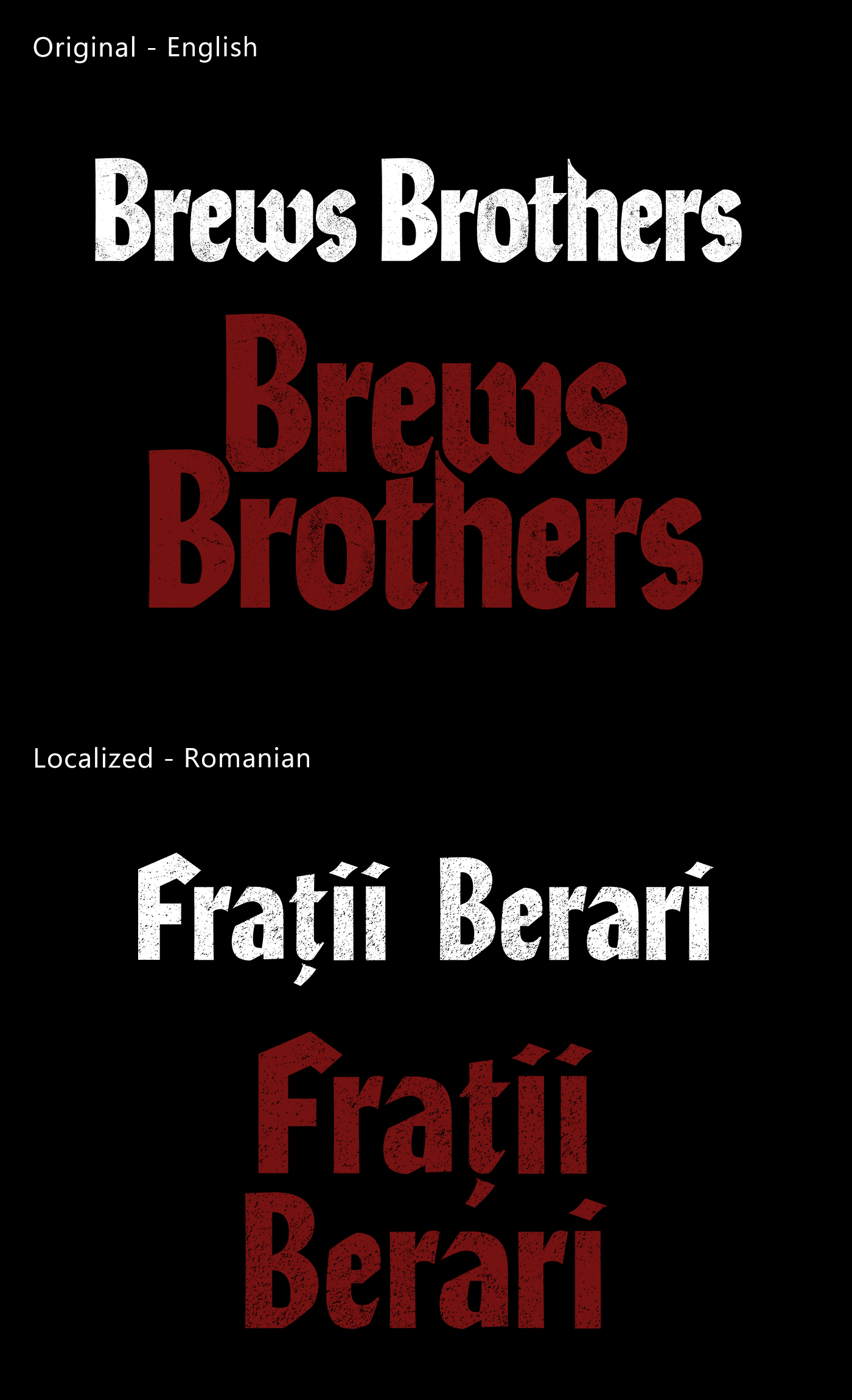
I led a team dedicated to creating and managing show title treatments in seven languages in the pre-production industry. My role as Component Leader involved cultivating a collaborative and supportive environment for our in-country designers, helping them enhance their design skills and creativity.
In my role as a Component Leader, Quality Assurance Specialist, and Typography Designer, I led the enforcement of design specifications and localization standards, significantly reducing error rates and improving the overall quality of deliverables. As a Typography Designer, I crafted title treatments that resonated with local audiences by incorporating linguistic and aesthetic depth, ensuring culturally relevant and engaging designs.
Danish, French, Canadian-French, Japanese, Korean, Norwegian(Bokmål), Romanian
Quality Assurance Process
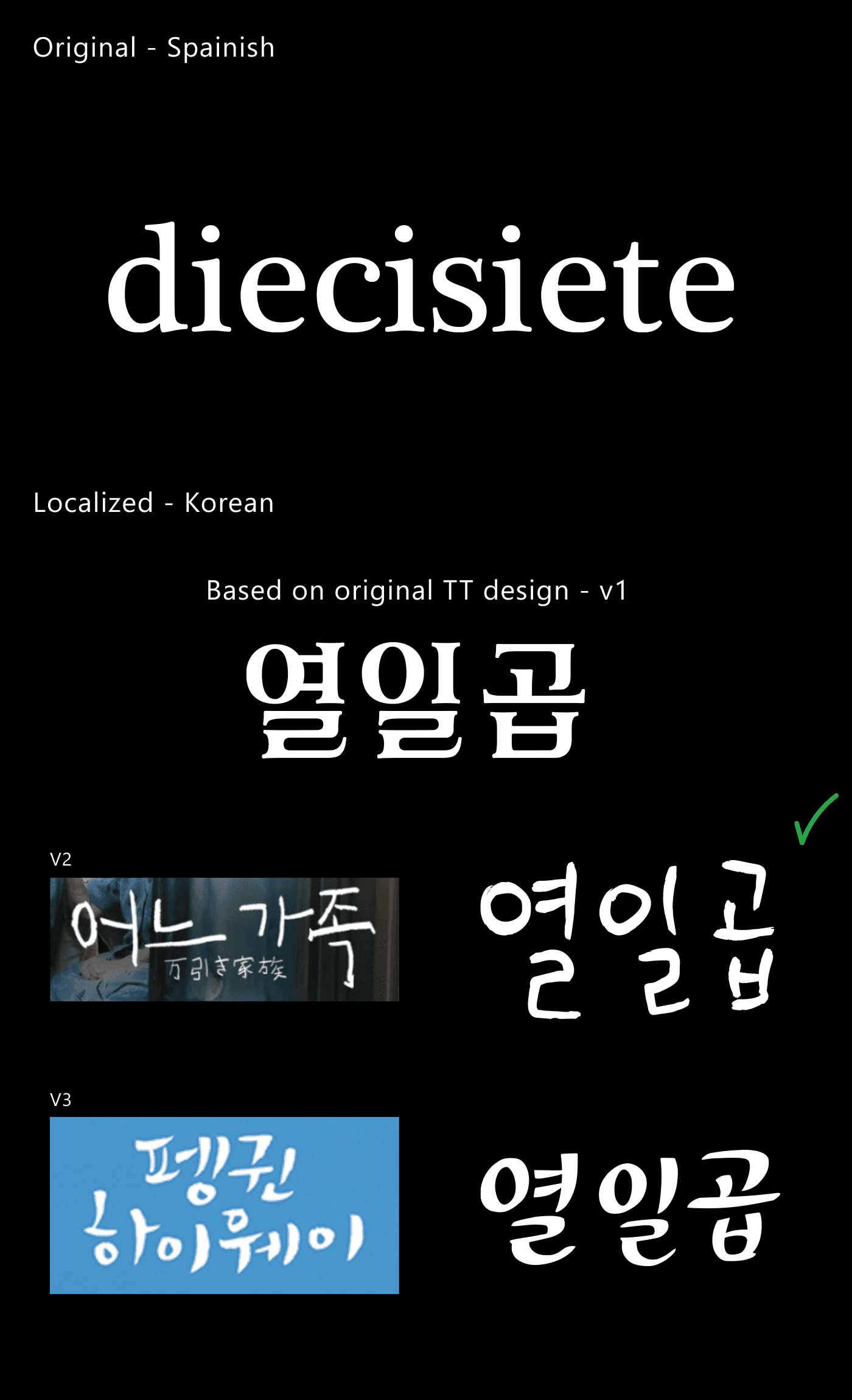
In the quality assurance process for localized title treatments, I use various methods to provide clear instructions to in-country designers. One effective approach involves researching the synopsis and tailoring title treatment styles to align with each country's unique production culture.
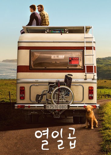
A prime example of this proactive approach is the title treatment for the film Seventeen. The Korean film industry demands high cultural relevance and aesthetic appeal, necessitating designs that convey a clear message.
Initially, I empowered the in-country designer to create a localized title using an English serif style. Then, I proposed two alternative title treatment options, accompanied by a culturally relevant image and the synopsis for client review. After receiving approval for the suggested style, I submitted a detailed request for the in-country designer to develop a unique title treatment style.
We ultimately created two additional design options, both suitable for Seventeen. When we presented these to the client, they selected Version 2 as the final design.
Title Treatment & Artwork
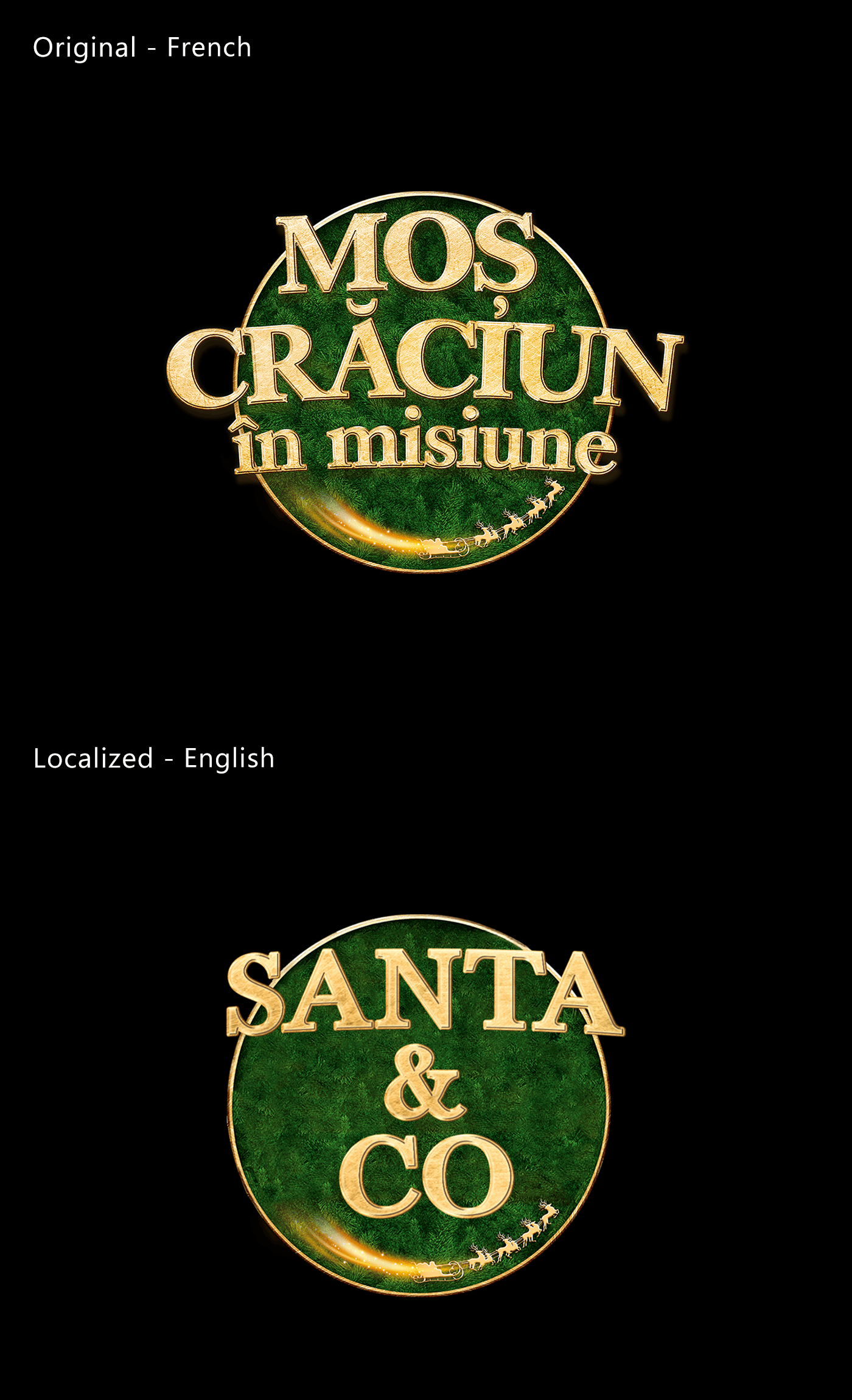
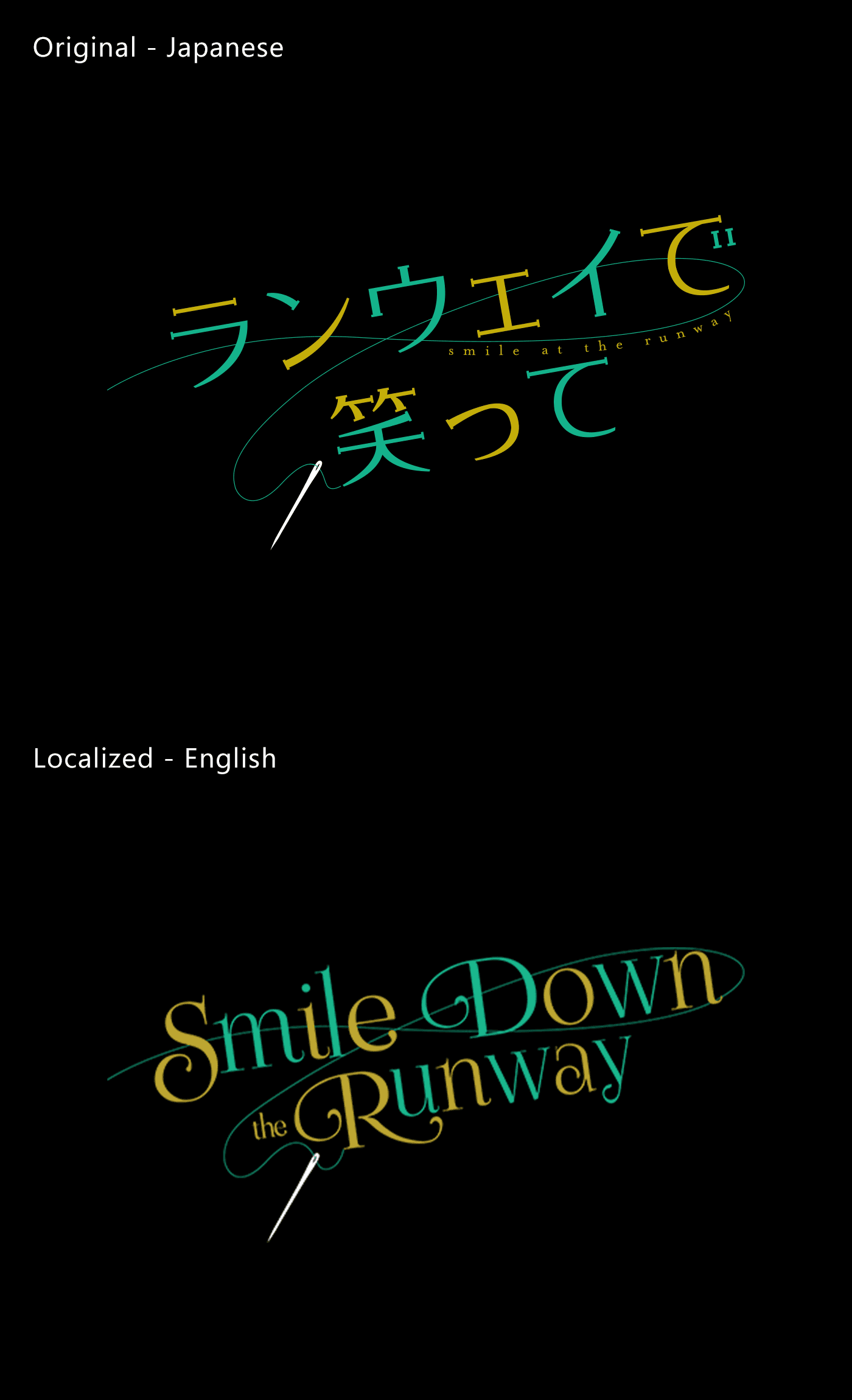
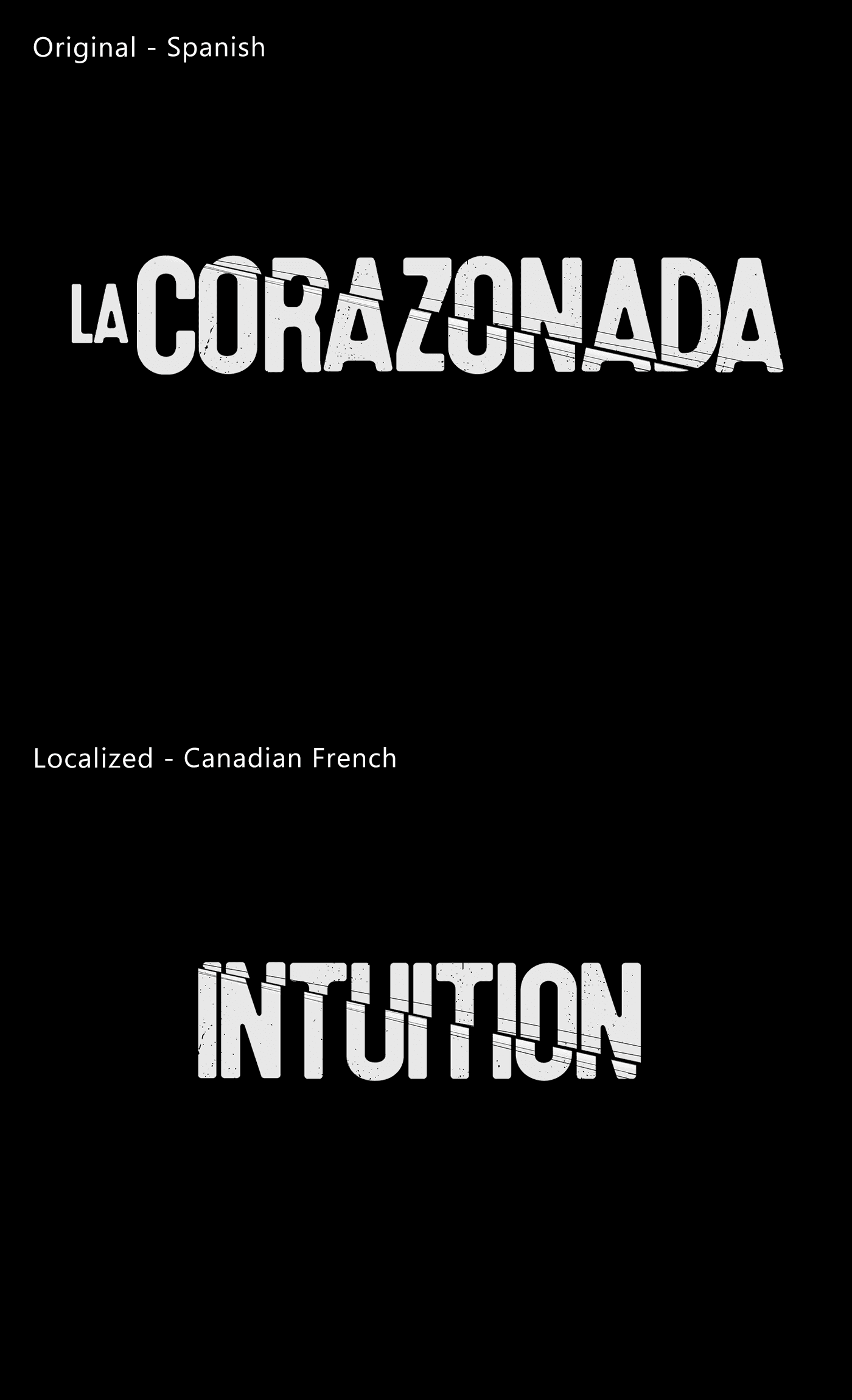
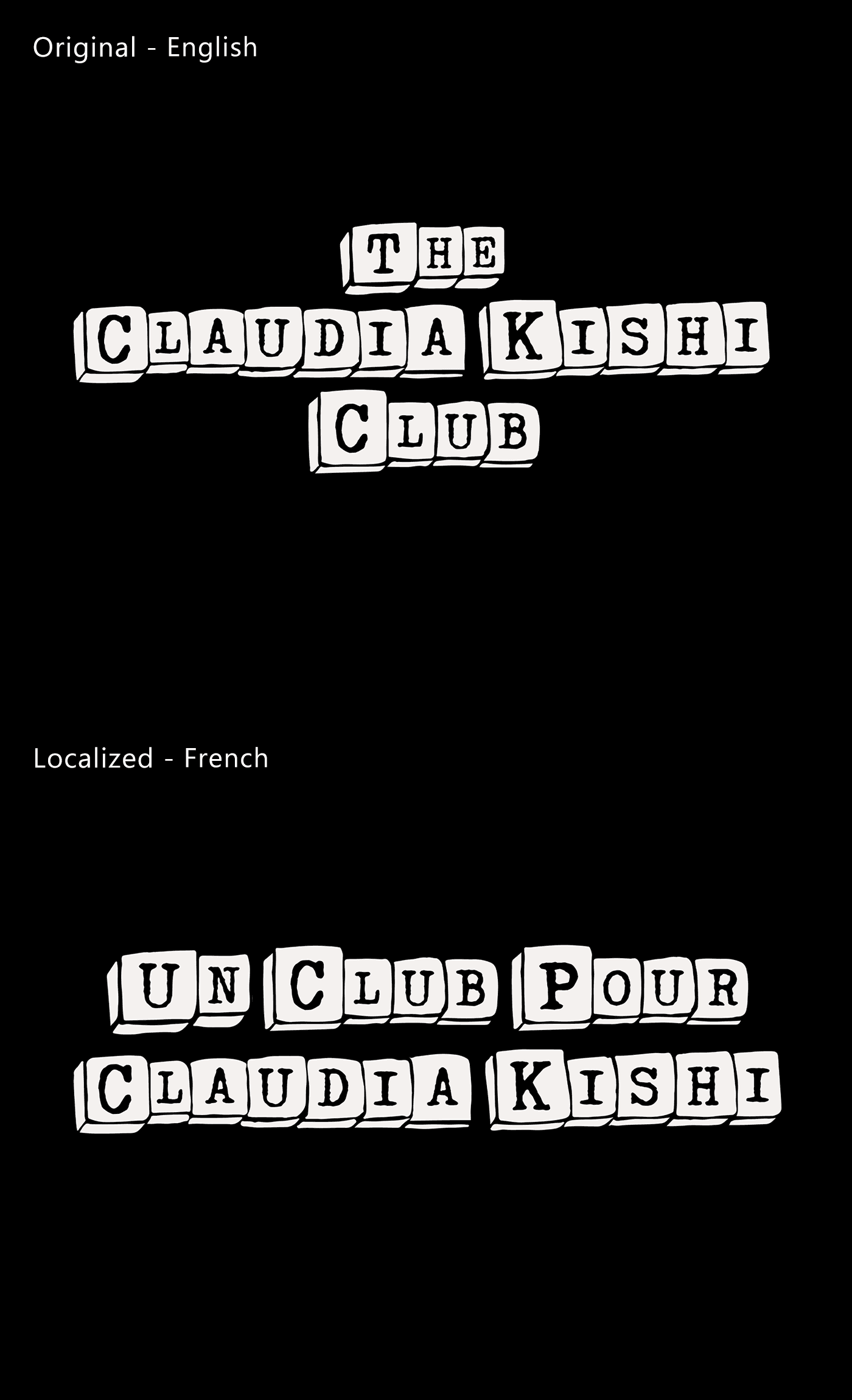
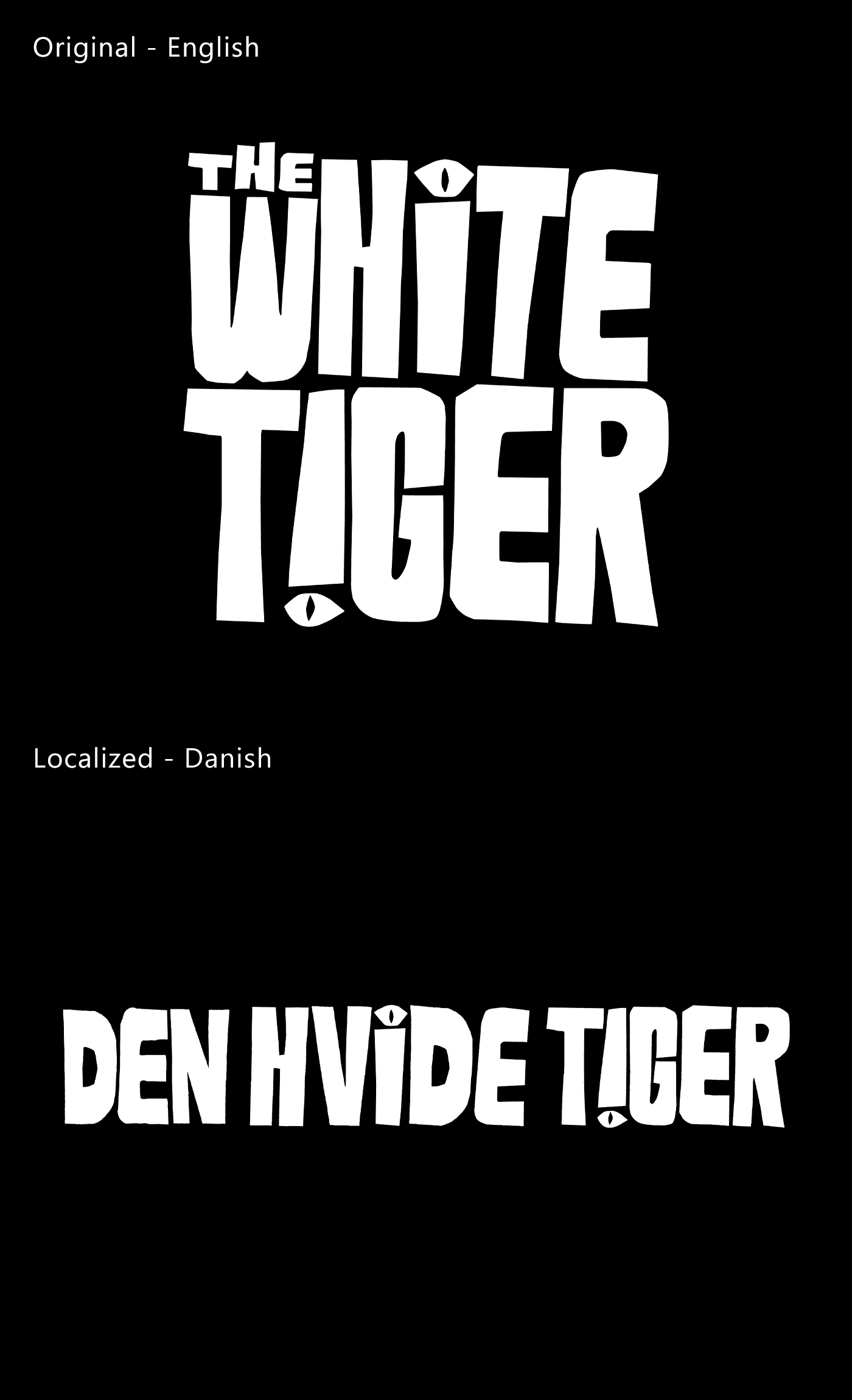
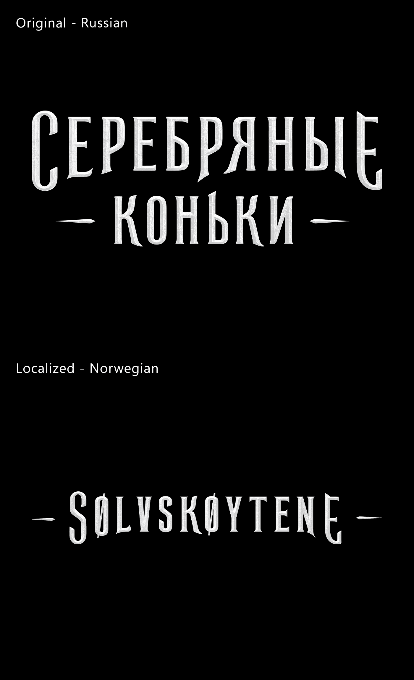
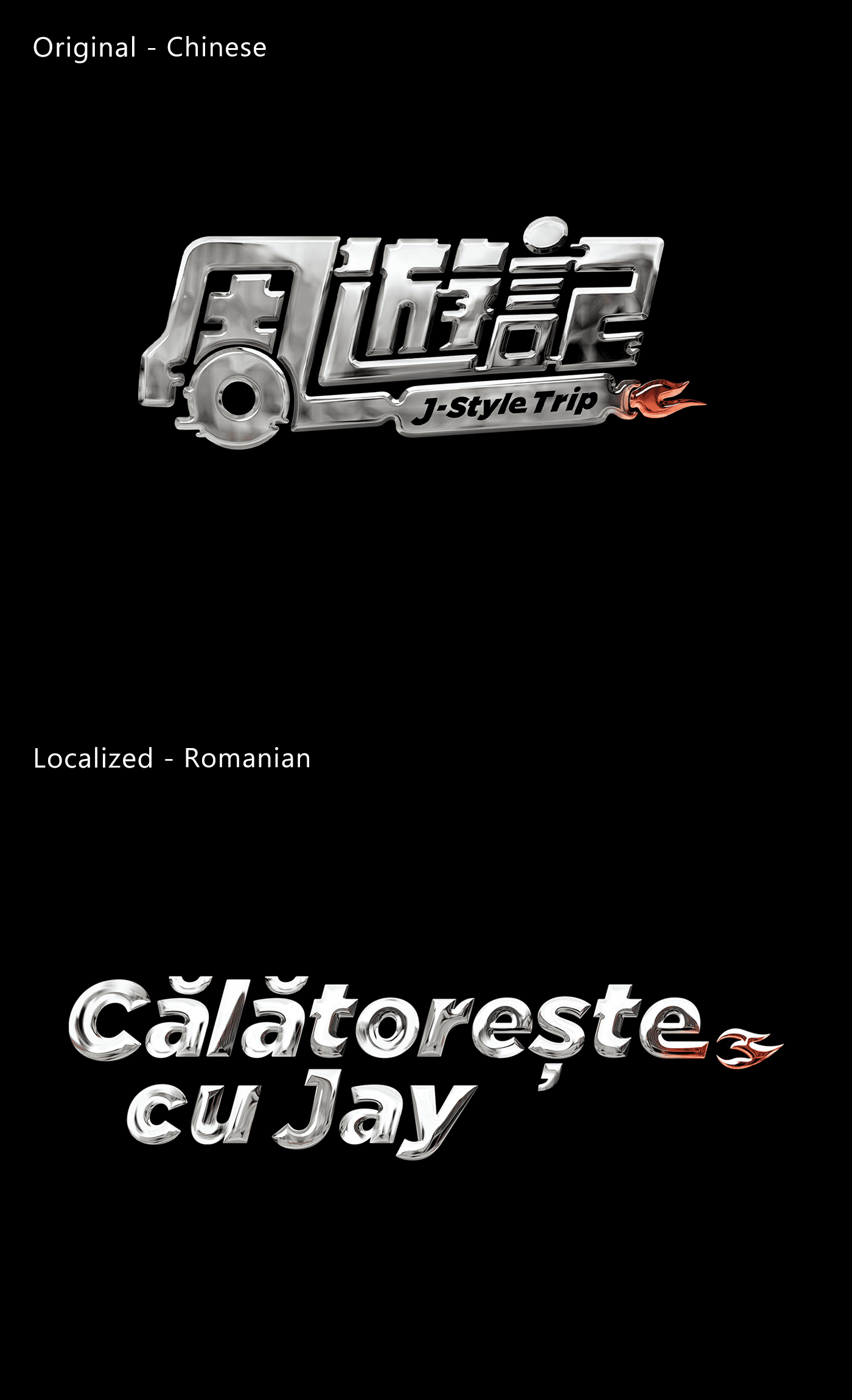
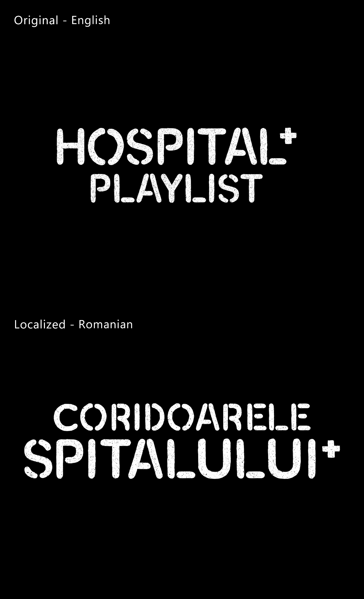
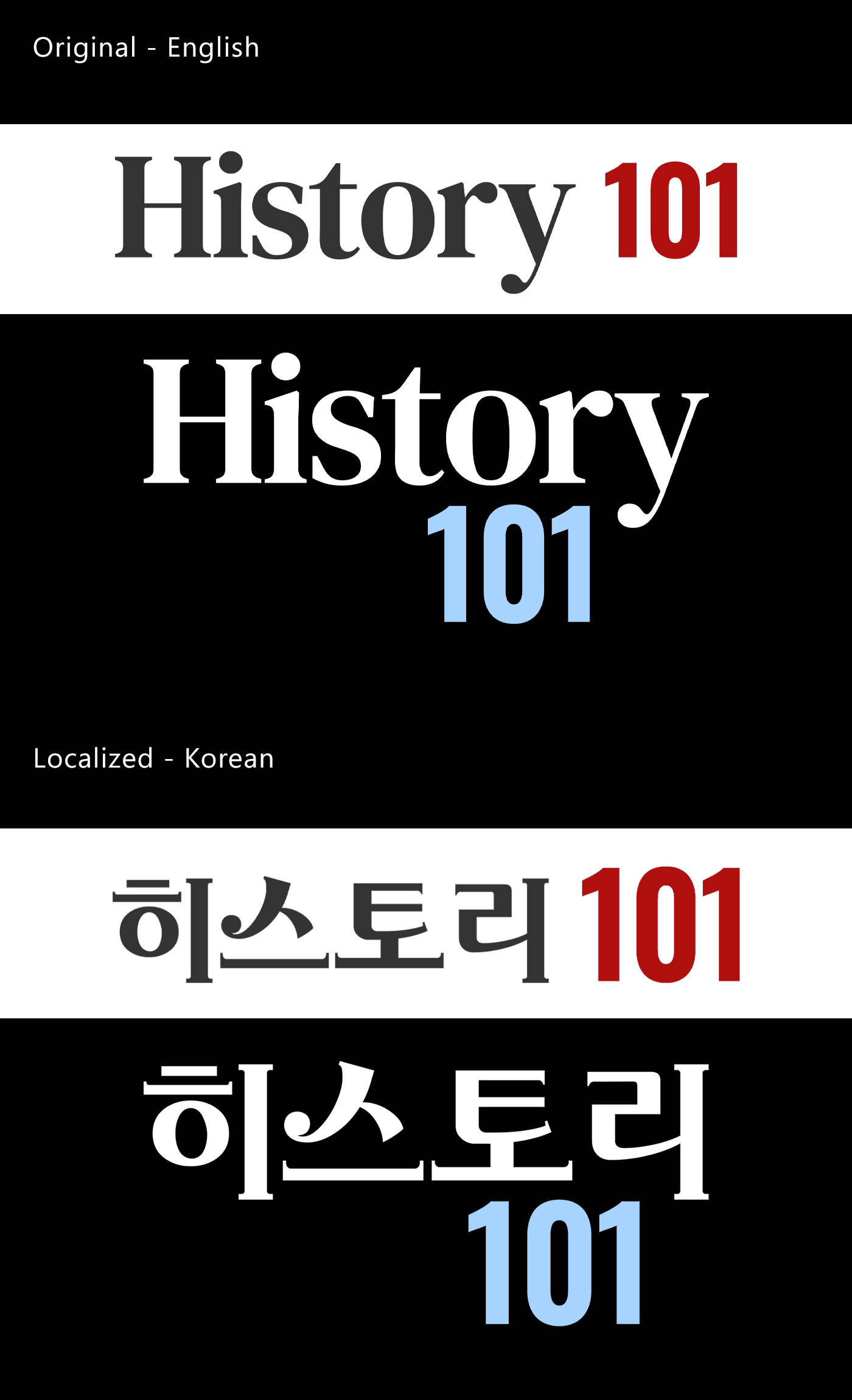
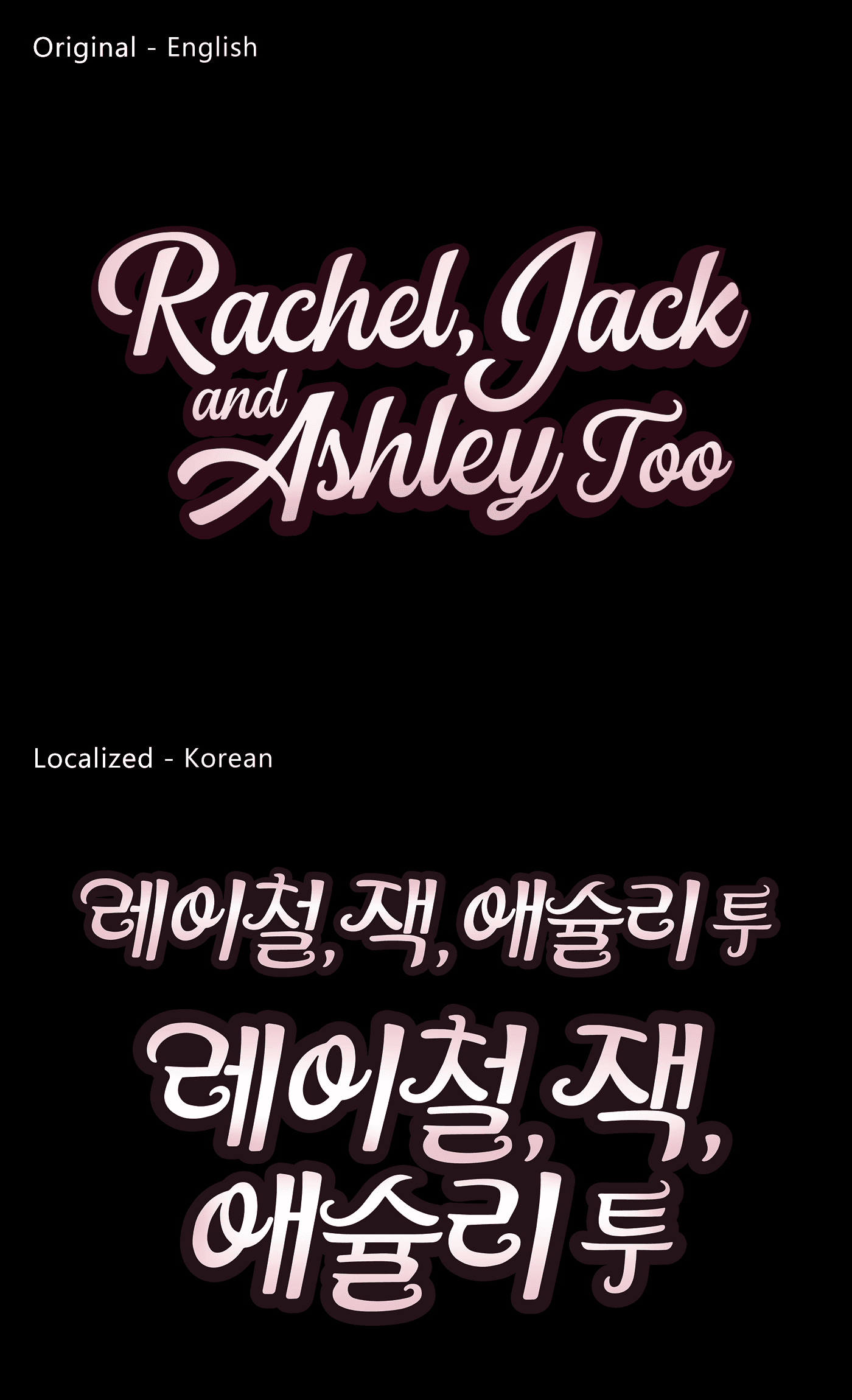
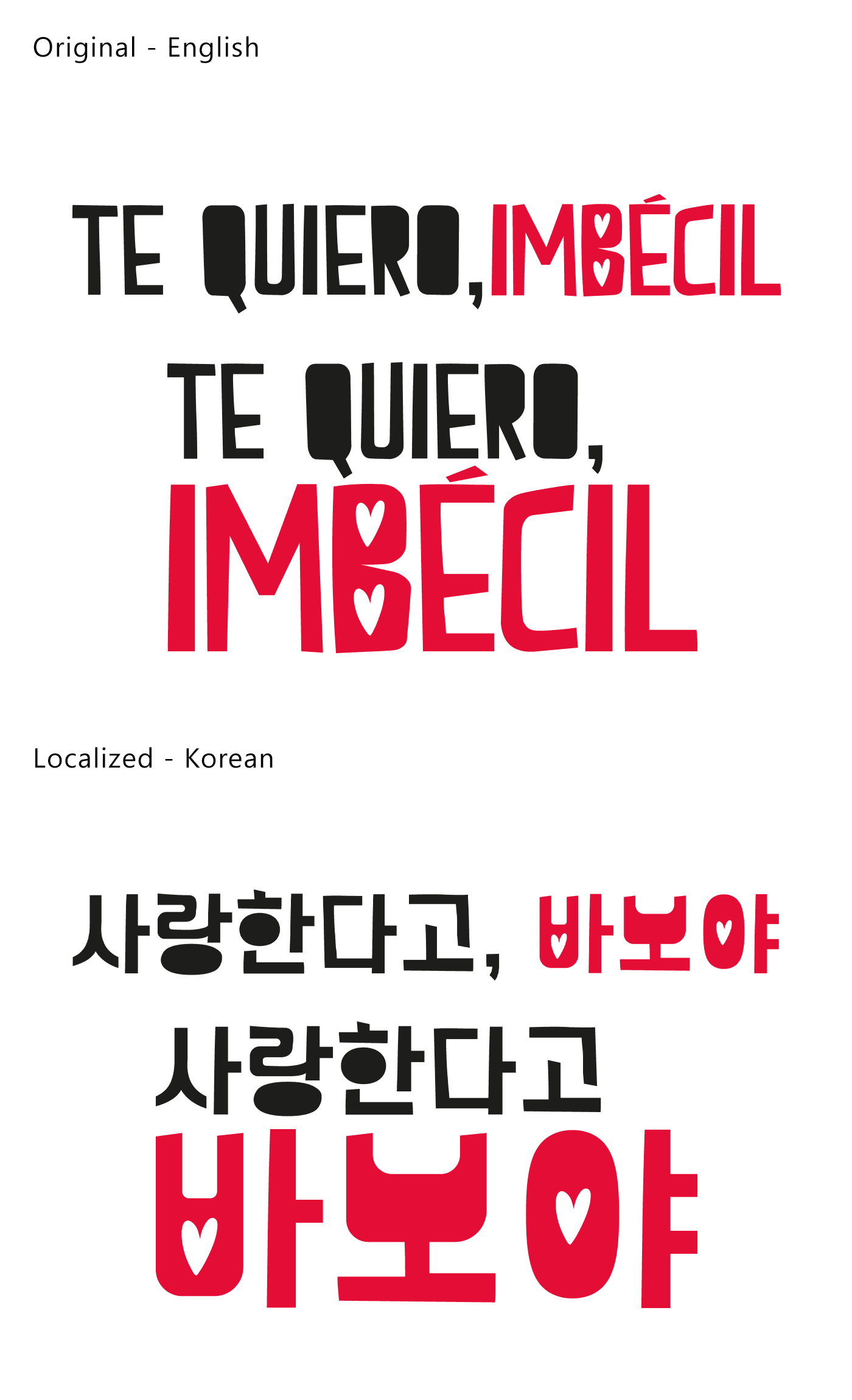
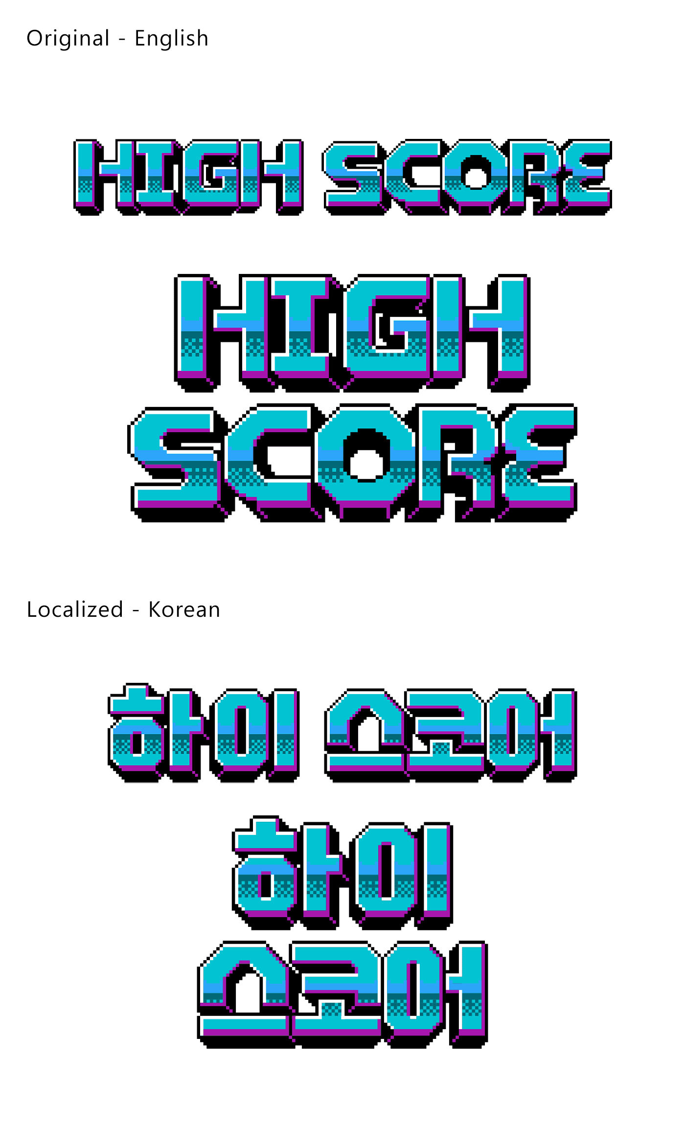
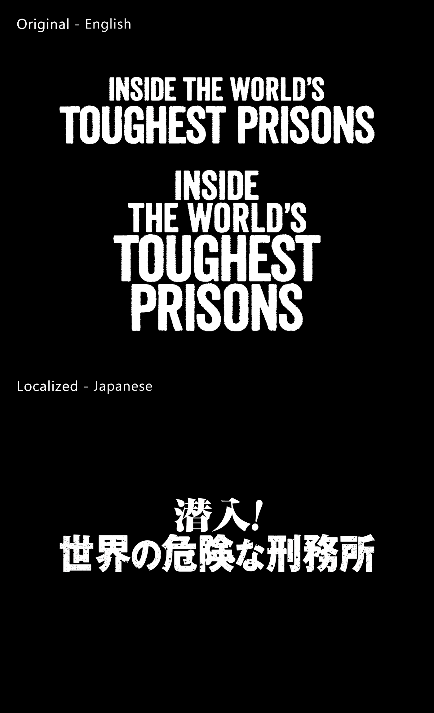
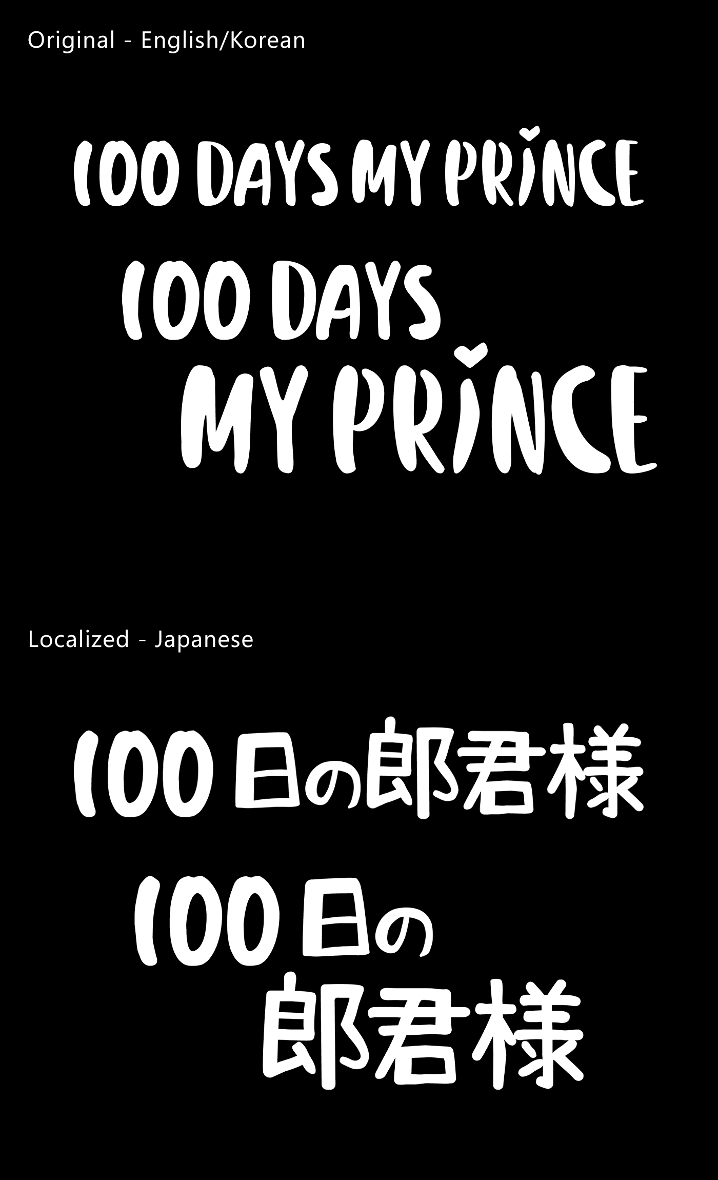
Original vs. Localized Language Comparison
English
Korean
Japanese


2025
Jinju Park